A brand identity refresh for one of Indonesia's leading forwarding companies.
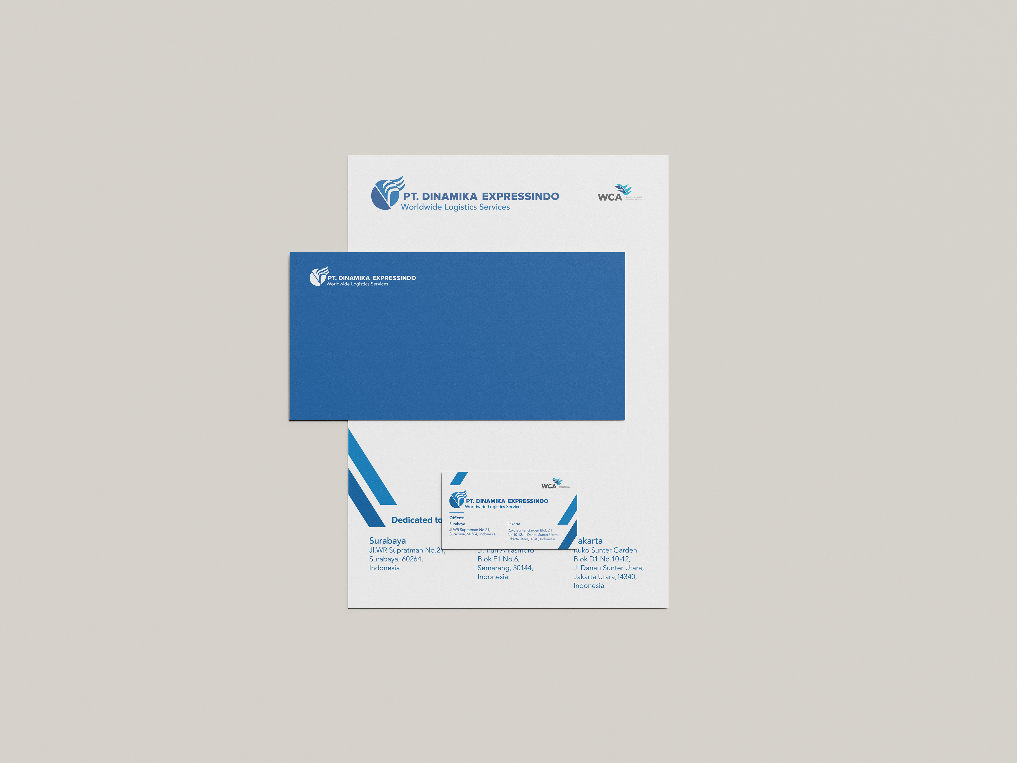
For more than 25 years, PT. Dinamika Expressindo has been one of Indonesia's leading freight forwarding companies. They are known for their all around services that include air freight, sea freight, warehousing, domestic and brokerage services.
With their recent celebration of moving into their brand new office building, the PT. Dinamika Expressindo saw it as a good opportunity to give their identity a new look while still keeping the essence of the old logo – an eagle. Meanwhile, it is also important that their new identity is able to represent more of the things that they stand for, such as their stellar service, their unique specialties, and the dynamic of their company.
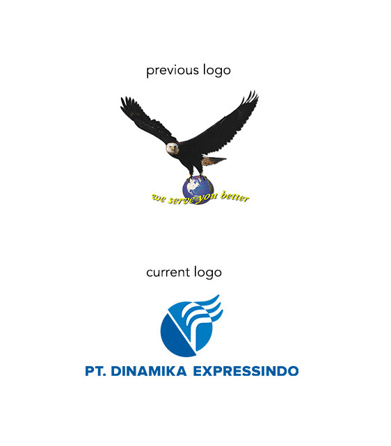
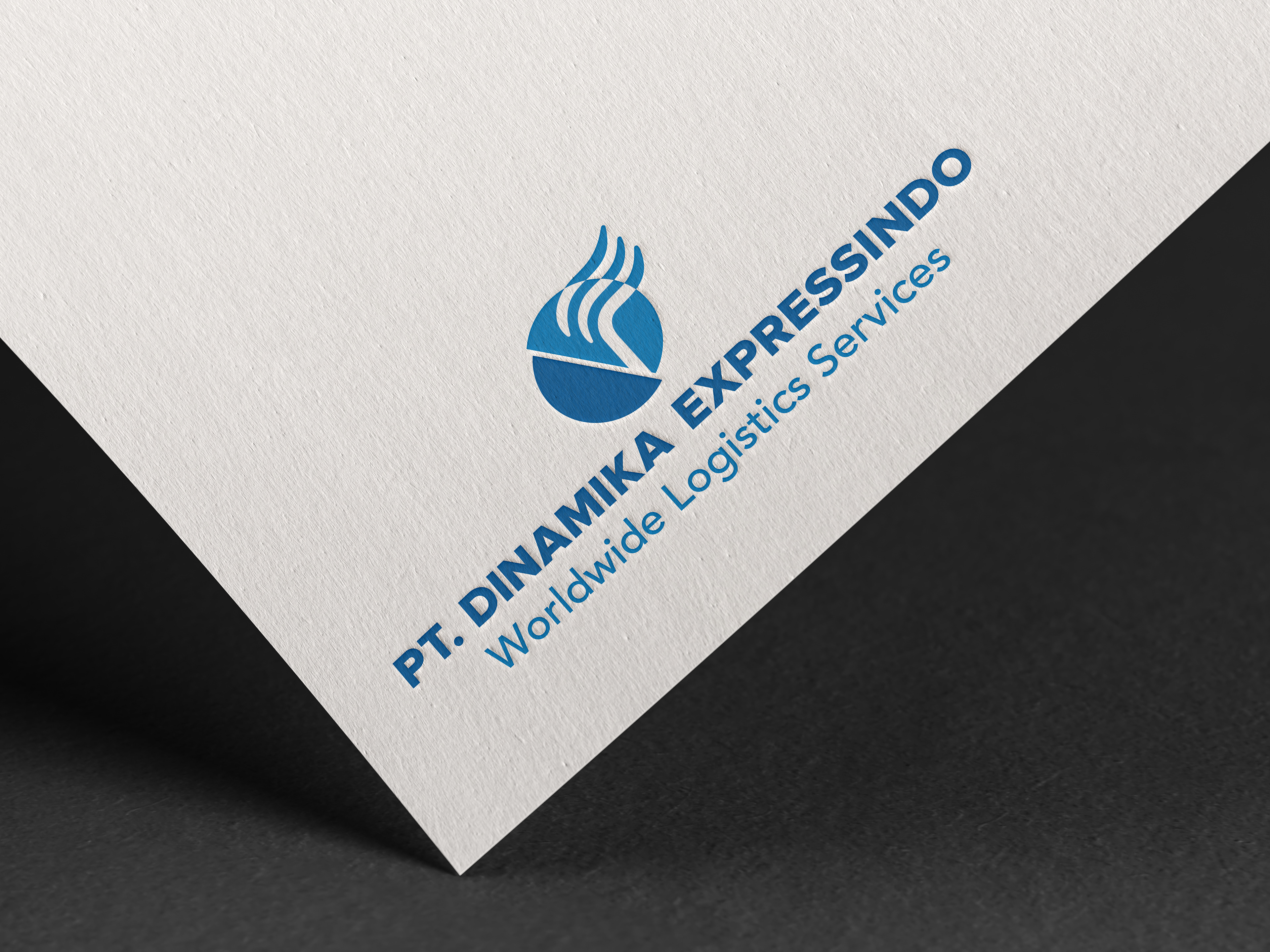
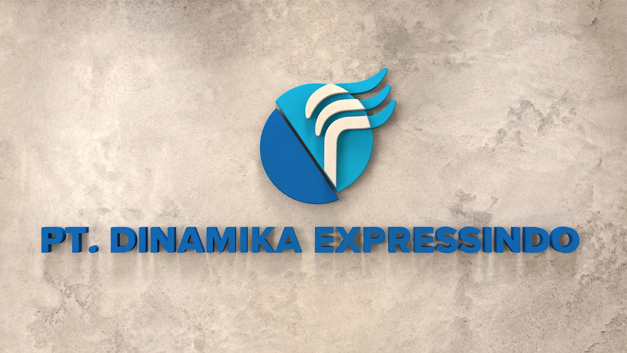
The logo is an abstraction of an eagle by representing the characteristics of the animal through shapes, lines, and colors. By doing that, the new logo is able to expand the meaning of their identity from just flight, to sea, and air. Moreover, the roundness and the curves of the new logo are meant to portray the dynamism of their work while the colors are meant to convey their outstanding service. Additionally, the mark creates an impression of the letter E along with the lighter colored semi-circle shape that creates the letter D for Dinamika Expressindo.
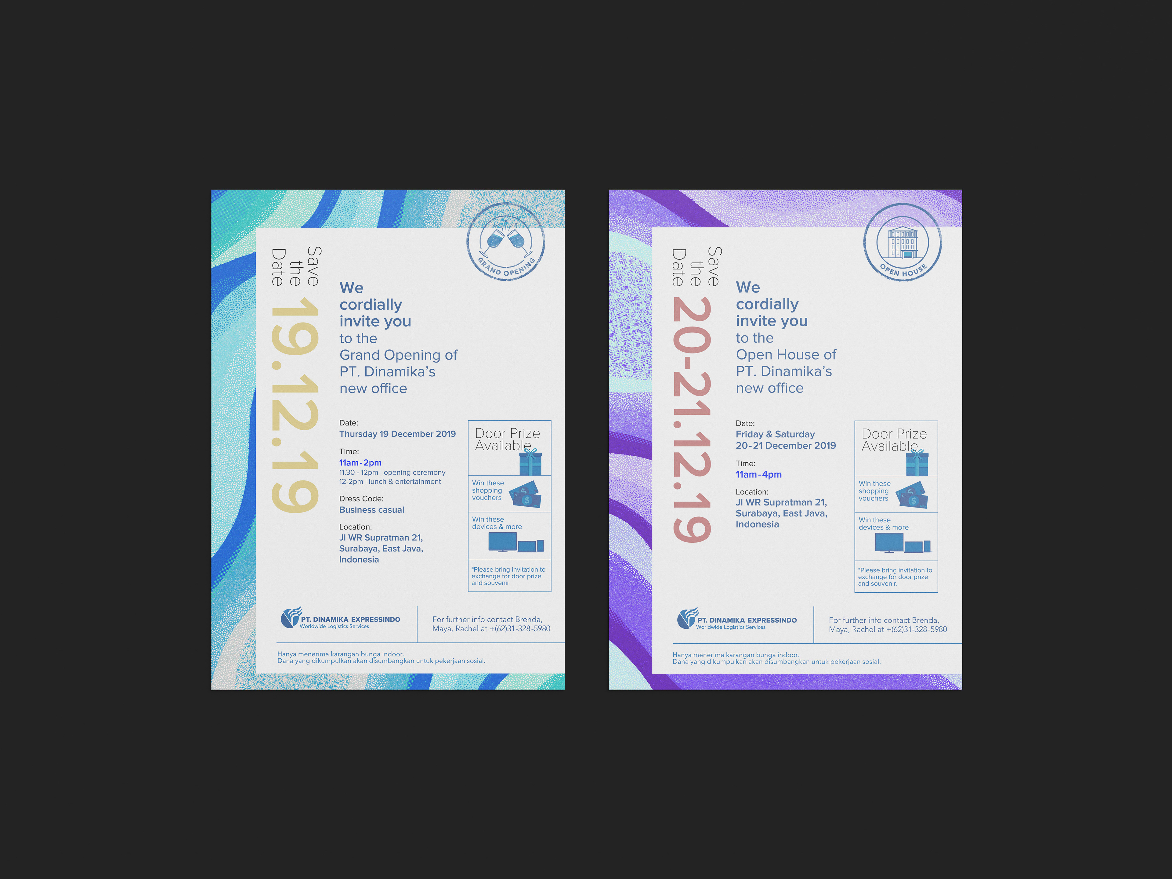
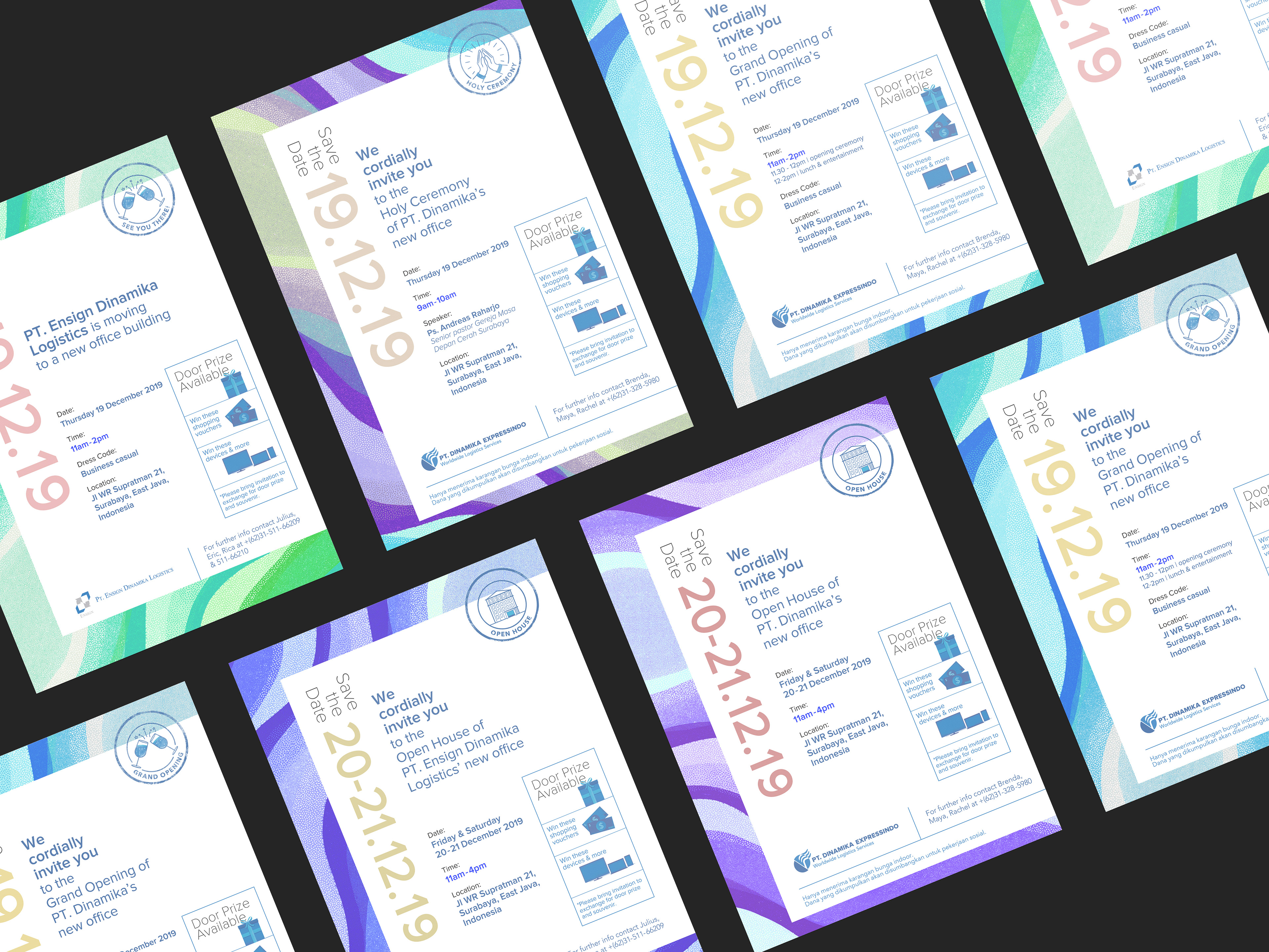
Along with the brand refresh, a series of invitations were made using a custom background that is inspired by the movement of water, sky, and the wings of an eagle.
Designed by: Fiona Liem
Client: PT. Dinamika Expressindo