A new look for the ethical brand designed to inspire everyone to live a clean life.
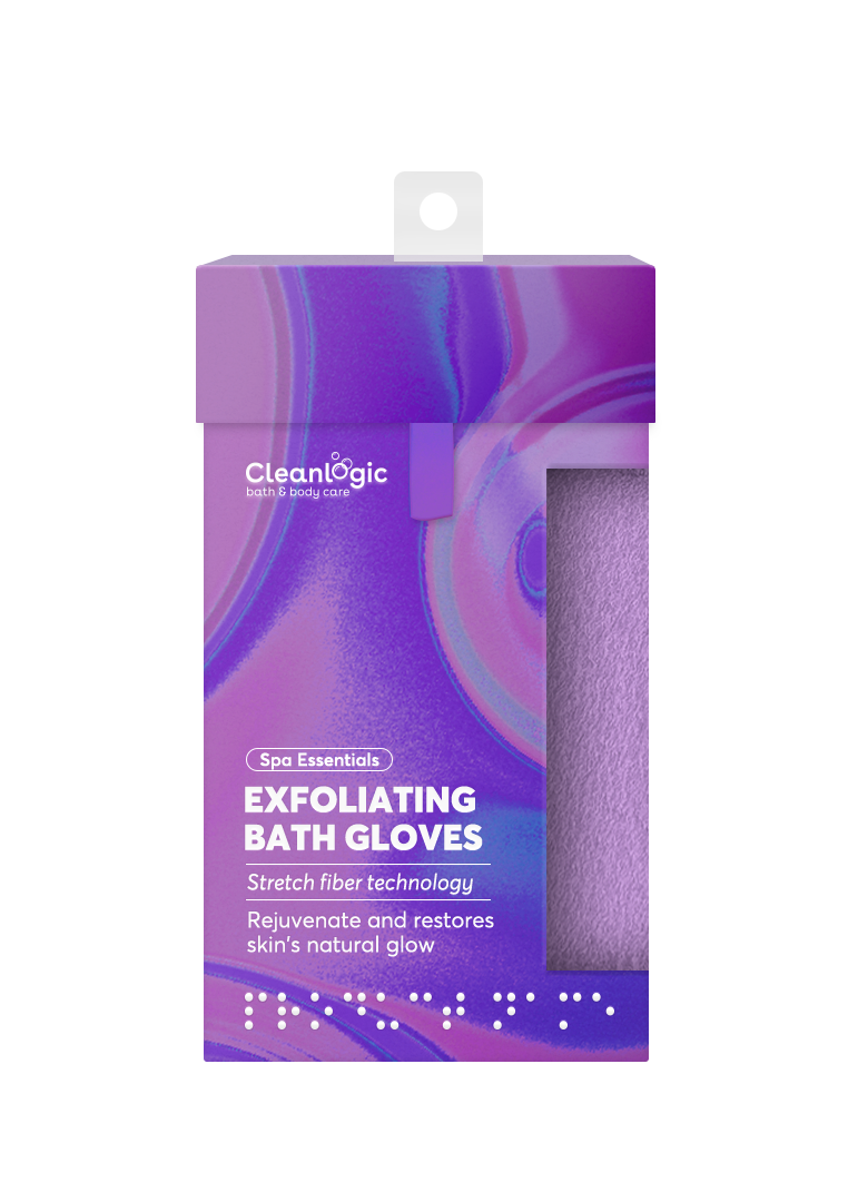
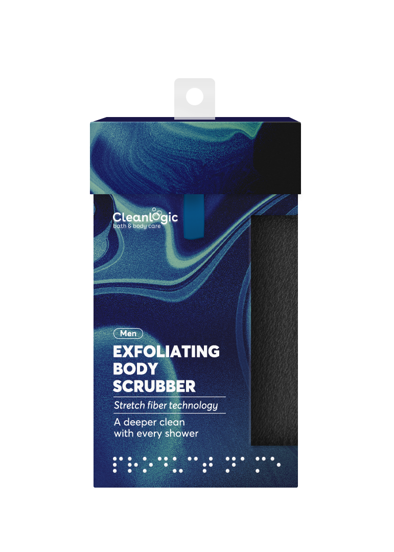
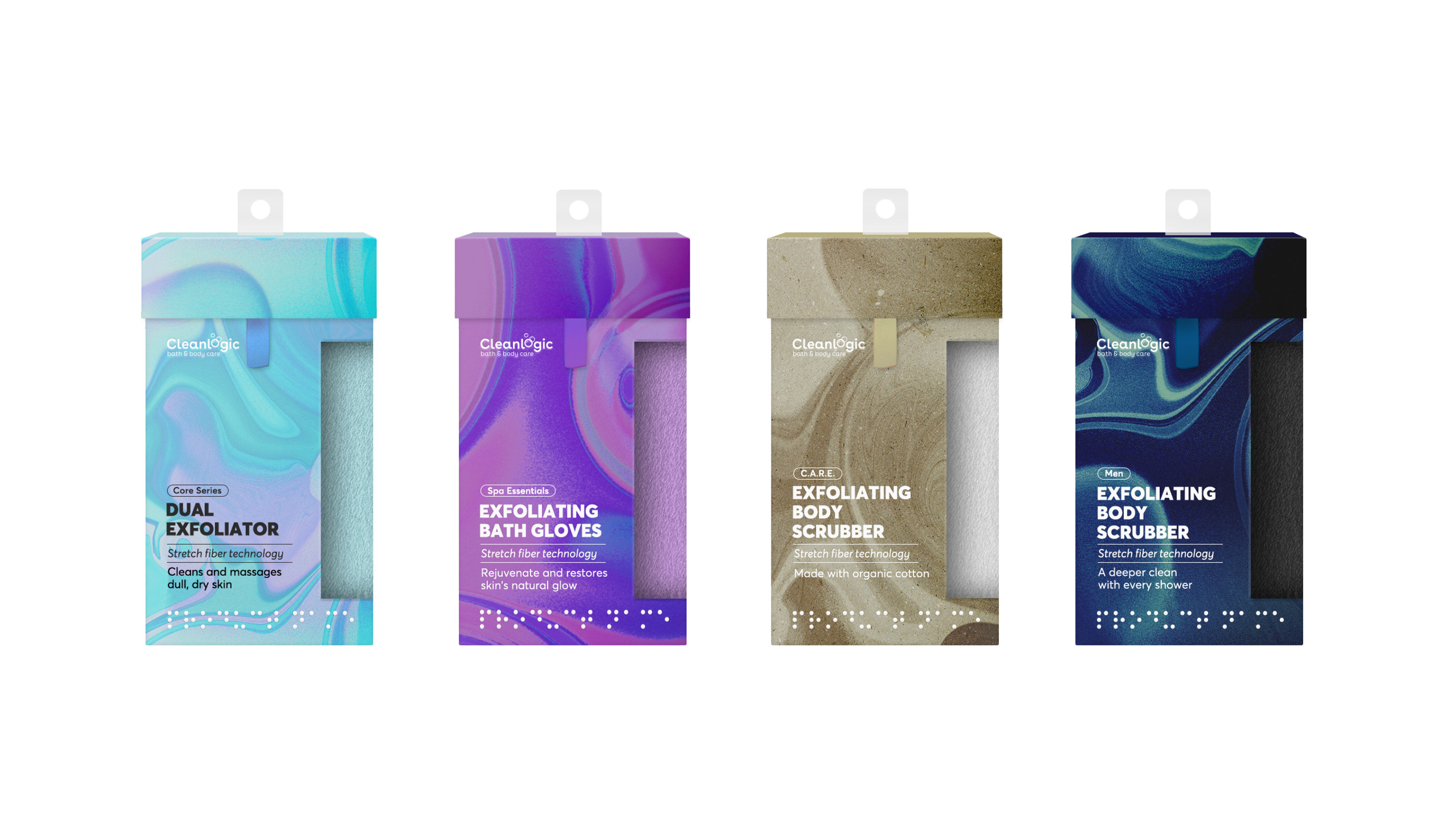
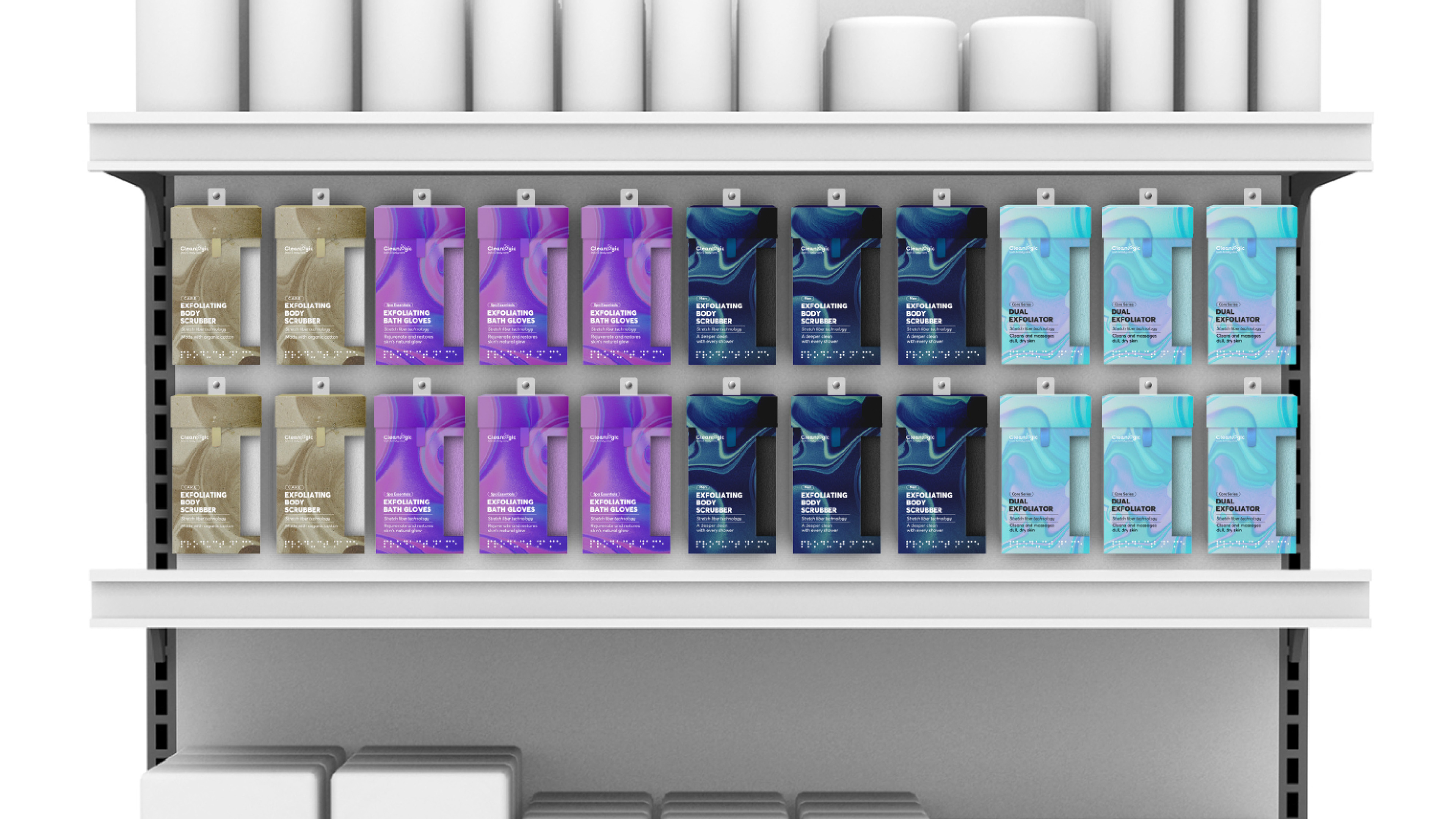
Clean Logic hopes to help the blind and the visually impaired to live a more independent life by incorporating the Braille system on their packagings.
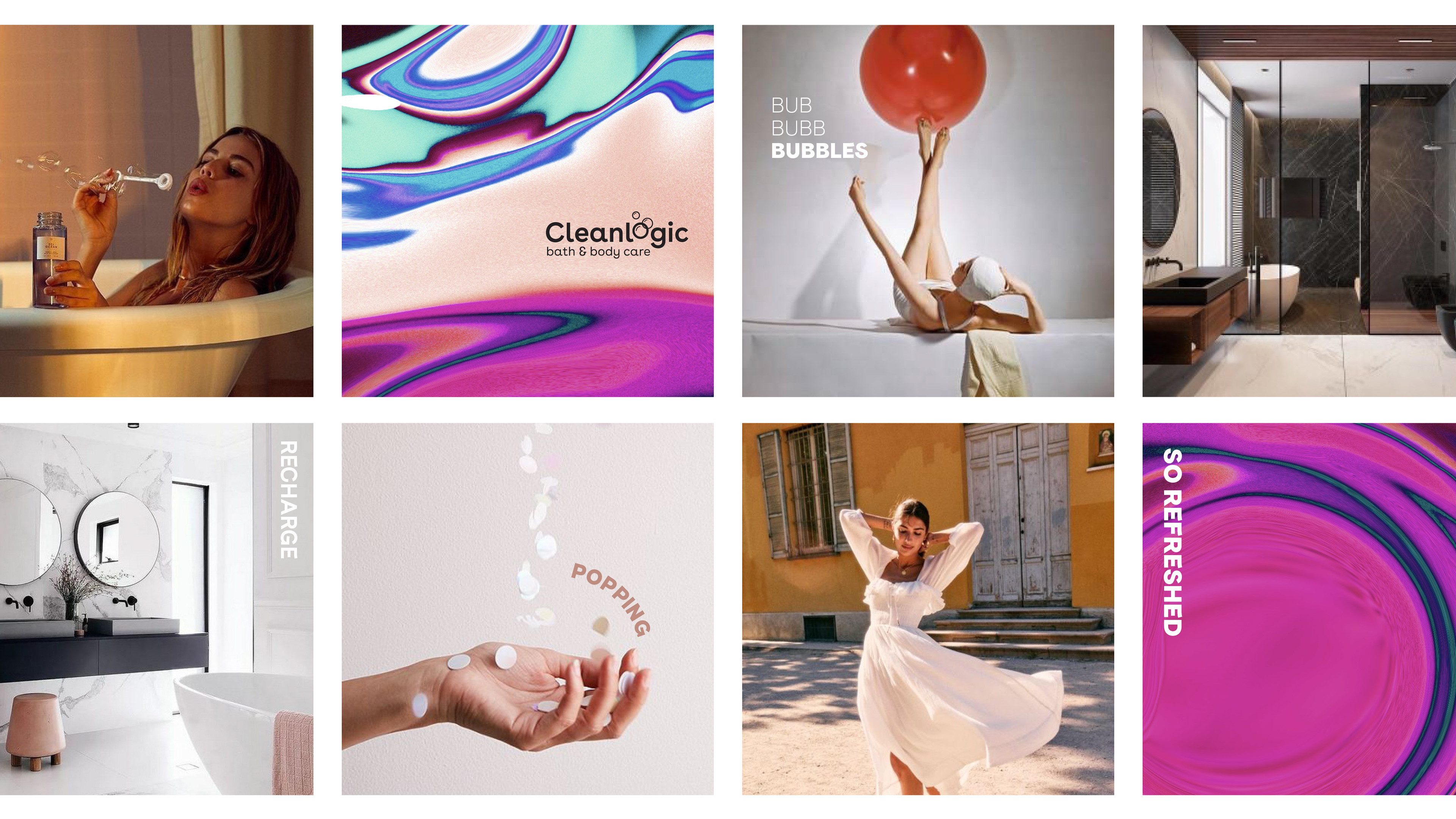
The new look is based on the abstract patterns formed when soap meets water to incite the relaxing feeling one gets after a quick shower or a long bath.
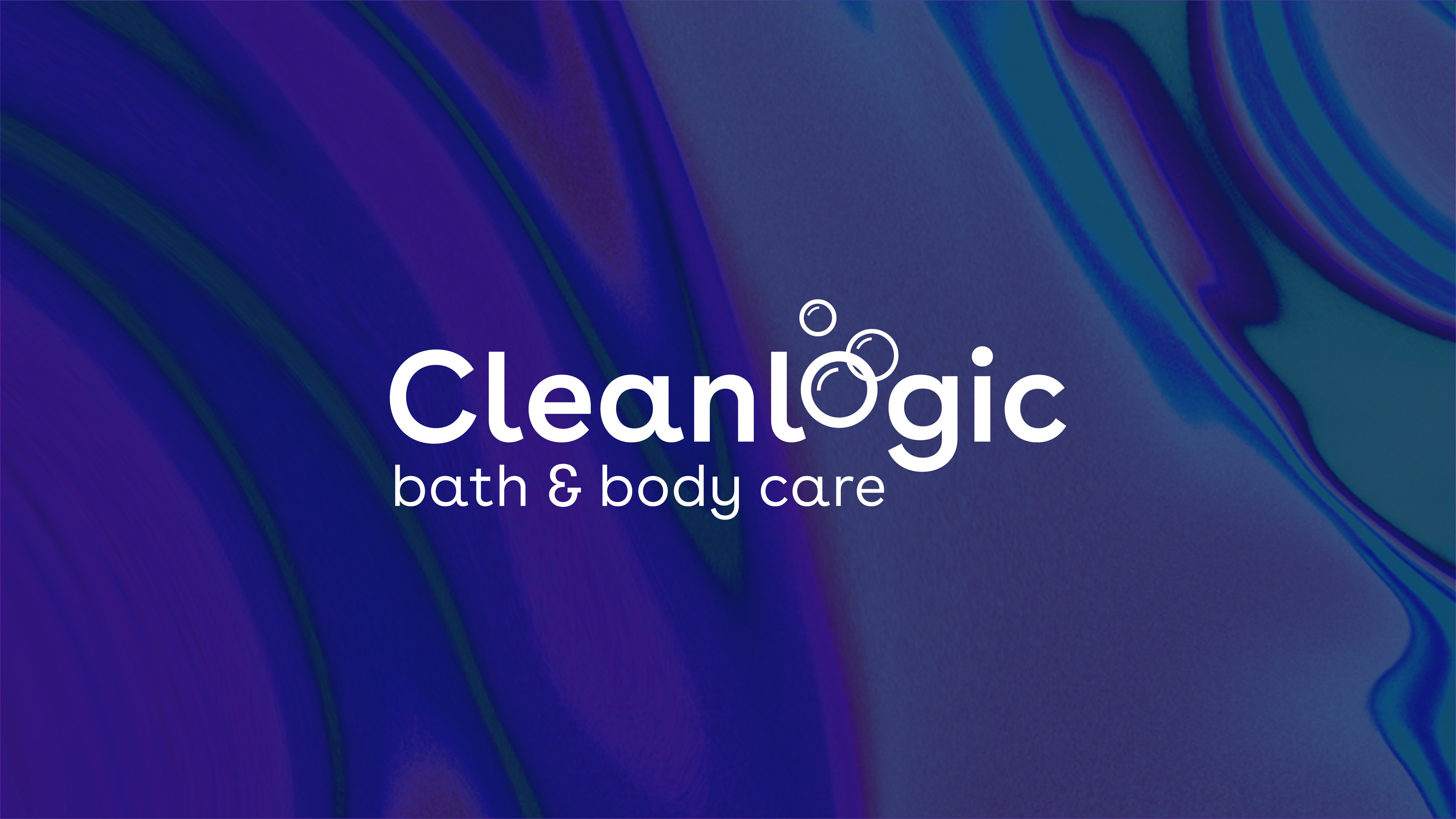
The logo is simple in order to give room for the pattern to shine. It's made up of soap bubbles and the choice of type is friendly and inviting yet professional.
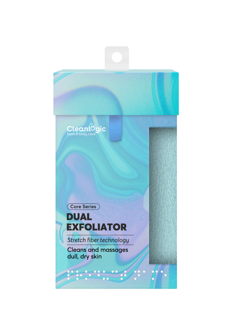
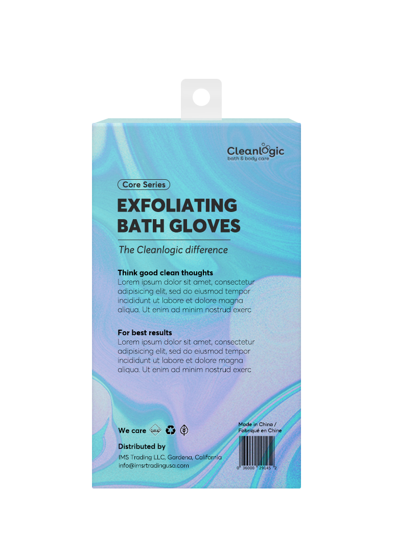
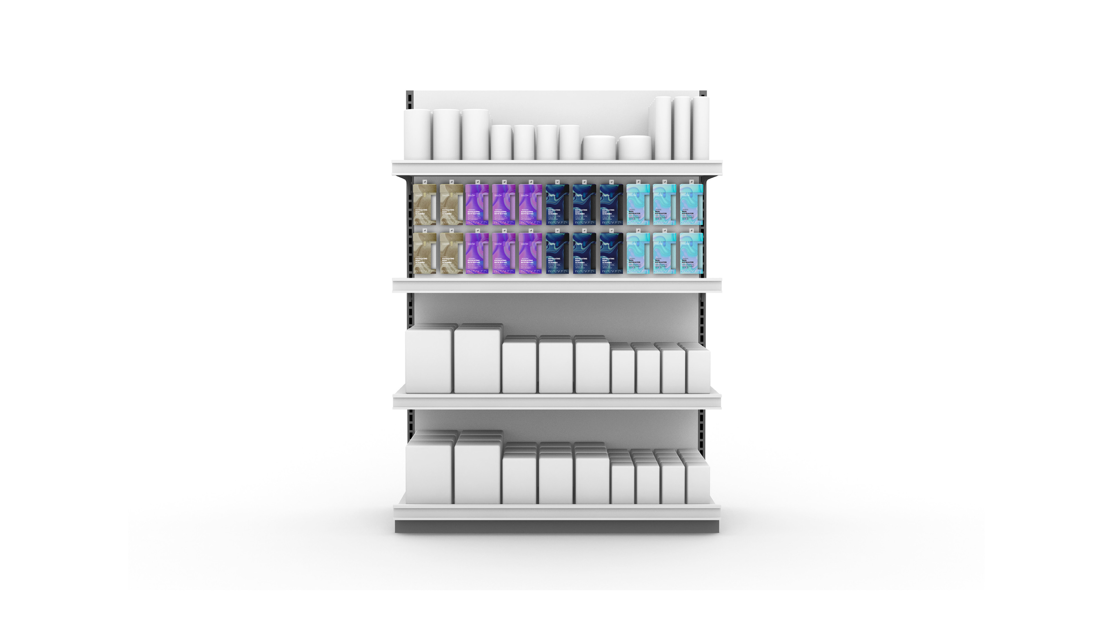
The packaging comes in four different designs to represent each line: Core series, Men's, C.A.R.E, and Spa Essential.
Mood board to inspire people to think good clean thoughts.
Designed by: Fiona Liem
My take on the client's pitch
Freelancer for Applied, New York
Client: Clean Logic
Creative Director: Craig Dobie
Managing Director: Katherine Pereira
Creative Director: Elliott Scott